Accessibility in Flutter : Tips for a more inclusive app
When you build an application, you must think how people with disabilities will be able to use it. But to get a fully accessible app is not that easy. In this article I will try to help with some tips or practices me and my team discovered during our journey with Flutter. Some are automated, some are more manual, in any case I will try to show you tips that are not discussed in the official accessibility documentation.
Unit testing : Meet Guidelines
I recently discovered that Flutter tests included a method called meetsGuideline. This method handles currently 3 mains guidelines that helps test automatically some accessibility key points.
Contrast
This guideline helps you check that color contrast is sufficient, which can help people with certain types of visual disabilities.
When you run a unit test on a widget, you can call this guideline like this :
await expectLater(tester, meetsGuideline(textContrastGuideline));And so when used in a complete testWidgets :
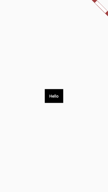
import 'package:flutter/material.dart';
import 'package:flutter_test/flutter_test.dart';

class MyWidget extends StatelessWidget {
  MyWidget({Key? key}) : super(key: key);

  @override
  Widget build(BuildContext context) {
    return MaterialApp(
      home: Container(
        color: Colors.black,
        child: const Text(
          'Hello',
          style: TextStyle(color: Colors.white),
        ),
      ),
    );
  }
}

void main() {
  testWidgets('Contrast Guideline on MyWidget is OK', (WidgetTester tester) async {

    final widget = MyWidget();

    await tester.pumpWidget(widget);

    await expectLater(tester,meetsGuideline(textContrastGuideline));
  });
}
In case of failure, you will be notified in logs of the problematic contrast ratio (I used green text on greenAccent) :
══╡ EXCEPTION CAUGHT BY FLUTTER TEST FRAMEWORK ╞════════════════════════════════════════════════════
The following TestFailure object was thrown running a test:
 Expected: Text contrast should follow WCAG guidelines
 Actual: <Instance of ‘WidgetTester’>
 Which: SemanticsNode#4(Rect.fromLTRB(0.0, 0.0, 800.0, 600.0), label: “Hello”, textDirection:
ltr):
 Expected contrast ratio of at least 3.0 but found 1.94 for a font size of 48.0. The
computed light color was: Color(0xff69f0ae), The computed dark color was: Color(0xff4caf50)
 See also: https://www.w3.org/TR/UNDERSTANDING-WCAG20/visual-audio-contrast-contrast.html
You can see the guideline respects the W3C guidelines.
Labels on buttons and interaction
People with visual disabilities, including blindness, may use screen readers to interact with your app. Each element they can interact with must have a text label, otherwise, they won’t be able to understand what the element does.
To unit test that, you can use the guideline :
await expectLater(tester,meetsGuideline(labeledTapTargetGuideline));And so when used in a complete testWidgets :
class MyWidget extends StatelessWidget {
  MyWidget({Key? key}) : super(key: key);

  @override
  Widget build(BuildContext context) {
    return MaterialApp(
      home: Container(
        color: Colors.black,
        child: TextButton(
          onPressed: () {
            print('Hello');
          },
          child: const Text(
            'Hello',
            style: TextStyle(color: Colors.white),
          ),
        ),
      ),
    );
  }
}

void main() {
  testWidgets('Tap Target Label Guideline on MyWidget is OK', (WidgetTester tester) async {

    final widget = MyWidget();

    await tester.pumpWidget(widget);

    await expectLater(tester,meetsGuideline(labeledTapTargetGuideline));
  });
}
In case it fails, you will see this message :
══╡ EXCEPTION CAUGHT BY FLUTTER TEST FRAMEWORK ╞════════════════════════════════════════════════════
The following TestFailure object was thrown running a test:
 Expected: Tappable widgets should have a semantic label
 Actual: <Instance of ‘WidgetTester’>
 Which: SemanticsNode#4(Rect.fromLTRB(0.0, 0.0, 800.0, 600.0), actions: [tap], flags: [isButton,
hasEnabledState, isEnabled, isFocusable], textDirection: ltr): expected tappable node to have
semantic label, but none was found
To make it fail, I just removed the label from the child Text.
Tap target size
Some users with motor impairment need a minimum target size for buttons. Material Design guidelines and Apple Guidelines also recommend to have a minimal tap target size for user comfort.
To test it, use these guidelines :
await expectLater(tester,meetsGuideline(androidTapTargetGuideline));
await expectLater(tester,meetsGuideline(iOSTapTargetGuideline));
And when used in a complete testWidgets :
class MyWidget extends StatelessWidget {
  MyWidget({Key? key}) : super(key: key);

  @override
  Widget build(BuildContext context) {
    return MaterialApp(
      home: Container(
        color: Colors.black,
        child: TextButton(
          onPressed: () {
            print('Hello');
          },
          child: const Text(
            'Hello',
            style: TextStyle(color: Colors.white),
          ),
        ),
      ),
    );
  }
}

void main() {
  testWidgets('Tap Target Size Guideline on MyWidget is OK', (WidgetTester tester) async {

    final widget = MyWidget();

    await tester.pumpWidget(widget);

    await expectLater(tester,meetsGuideline(androidTapTargetGuideline));
    await expectLater(tester,meetsGuideline(iOSTapTargetGuideline));
  });
}
Golden tests : A11Y and landscape screen orientation
If you never heard of goldens, here is a quick summary : its a type of unit test built in Flutter which allow you to take a screenshot of a widget. Next time you will run tests, it will break if one pixel has changed, and you will be show a visual pixel perfect diff. I use this package helper golden_toolkit which offers devices sizes and helpers to modify font size.
How can we take advantage of this mechanism to help us build a better app ?
A11Y
When you make a golden, you can increase the font size by 200%, which is the W3C recommended size when testing accessibility. This will ensure you that your app screens won’t break with big dont sizes.
import 'package:golden_toolkit/golden_toolkit.dart';

void main() {
  testGoldens('Golden AY11 on MyWidget is OK', (WidgetTester tester) async {

    final widget = MyWidget();

    await tester.pumpWidget(widget);

    await multiScreenGolden(tester, 'MyWidget', devices: [Device.phone, Device.phone.copyWith(name: 'a11y', textScale: 2)], finder: find.byType(MyWidget));
  });
}

Screen Orientation in Landscape mode
You could lock your app in portrait mode, but some users will prefer or need to use landscape mode (it’s a W3C essential rule). Use the previous technique, but with a special device configuration to display your screen in a golden landscape mode. This will check for overflows on your screen in landscape mode :
testGoldens('Golden Landscape on MyWidget is OK', (WidgetTester tester) async {
  //Given
  final key = GlobalKey();

  final widget = MyWidget(key: key);

  await tester.pumpWidget(widget);

  await multiScreenGolden(tester, 'MyWidget',
      devices: [Device.phone.copyWith(size: Size(Device.phone.size.height, Device.phone.size.width))],
      finder: find.byType(MyWidget));
});
Enable showSemanticsDebugger
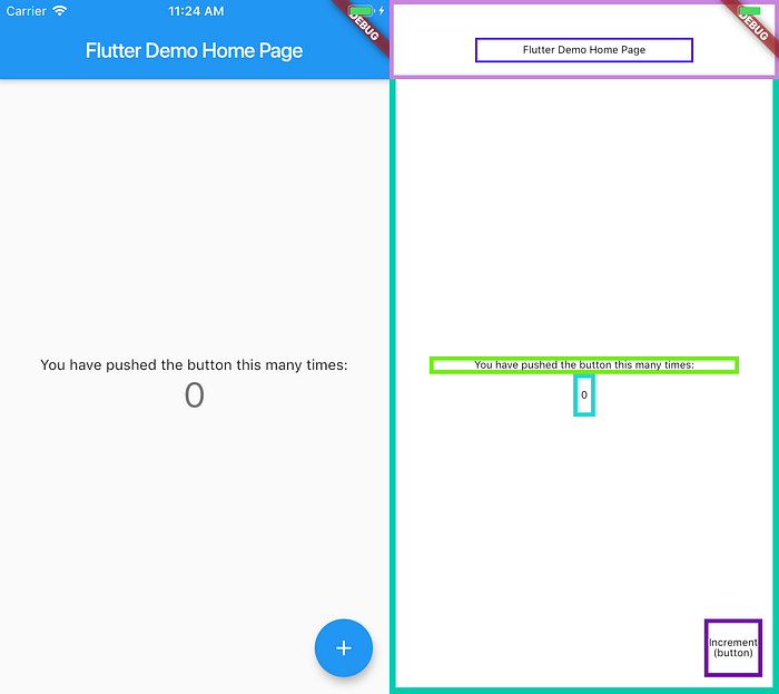
When you want to check that labels are accessible in your app, you can use a screen reader like TalkBack on Android or VoiceOver on Ios. In Flutter you can also enable showSemanticsDebugger mode, which will display only squares instead of your widgets with their accessible labels. It’s not a perfect accessibility manual test, as it will not take in account the reading order of the texts, or a pronunciation error, but it’s a first rapid check that labels are present and relevant :
class MyApp extends StatelessWidget {
  MyApp({Key? key}) : super(key: key);

  @override
  Widget build(BuildContext context) {
    return MaterialApp(
      title: 'My App',
      showSemanticsDebugger: true,
      debugShowCheckedModeBanner: false,
      home: MyWidget(),
    );
  }
}
This technique will help you make a quick visual check on your app. You can make golden unit tests in accessibility mode, for this just encapsulate your widget like this to display accessible labels in your golden :
SemanticsDebugger(
        labelStyle: const TextStyle(
          fontFamily: default_police,
          color: Color(0xFF000000),
          fontSize: 10.0,
          height: 0.8,
        ),
        child: widget,
 ),
Use Semantics with End To End Tests
In my team, we make end to end tests using accessible labels to navigate. Each test use accessibility labels to find buttons or interactions in screen searching by his content-desc / accessibility id. For that we use Appium, which is agnostic from Ios or Android, and for example UIAutomator to verify labels on Android :
Study disabilities guidelines recommandations for Flutter and more generally
Sometimes Flutter and his animations leads us to beautiful interactions like swipes or drag systems that are.. totally unusable for people with disabilities. The simplest UX patterns are often the better ones. When you want to offer something different, add a fallback to your interactions, when you detect a screen reader is enabled or add an entry in your app settings. To detect a user has enabled a screen reader, use this media query :
MediaQuery.of(context).accessibleNavigationSome resources :
https://www.w3.org/TR/mobile-accessibility-mapping/
Tips about Semantics
Semantics widgets are available in a lots of Flutter base widgets. Sometimes they expose label fields, sometimes not because the mapping is already made inside the widget. Try to always check for Semantic in a stock widget tree and configure fields like explained in the docs.
When you make custom widgets, use your own Semantics encapsulation to add information on your interactions. Don’t hesitate to use ExcludeSemantics when you feel a widget does not convey any information.
For example, the stock widget Image is not accessible by default. You must add the semanticLabel filed or ExcludeSemantics on the image if it does not add information for the user :
Image(
  semanticLabel: 'A nice but useless picture',
  image: NetworkImage('https://flutter.dev/assets/flutter-lockup-1caf6476beed76adec3c477586da54de6b552b2f42108ec5bc68dc63bae2df75.png'),
)
How Accessibility works in Flutter on each platform
As written in Flutter architecture, accessibility is bridged per target, to use existing accessibility mechanism : https://flutter.dev/docs/resources/architectural-overview
Ios And Android
Except for web views, accessibility should work the same way as for native apps. Some issues exist on Flutter github, but globally it works well. Actually it’s hard to find detailed documentation about Ios and Android bridges.
Web
Here is a detailed explanation by Mariam :
On the web, we generate a second DOM tree parallel to the DOM tree used as the RenderObject tree and translate the flags, actions, labels, and other semantic properties into ARIA.
Mac Windows and Linux
Desktop targets are still in beta, and work is still in progress to map accessibility : https://github.com/flutter/flutter/issues/73819
Conclusion
Flutter still has room for improvements to make great accessible apps, but there are already a lot of tools and mechanisms available to make your app inclusive for most peoples. Just test as much as you can, with automated tests and complete with manual, and your app should be great !
Make an inclusive app is a day to day attention, so thanks to all my fellows co-workers UXs/Developers/QAs who try every day to take up the challenge !
